The Start of the Story
A design challenge is a very common task that designers may receive during a UX interview. In my final interview of a product designer position, I got a design challenge right after my portfolio presentation.
In the end, my output of the design challenge led to a positive hiring decision. Therefore, I am writing up this story to share my design processes with fellow designers.
DESIGN CHALLENGE INSTRUCTION:
Improve the interaction of one main action on your chosen brand’s homepage or website (e.g. a booking, a checkout, form, or whatever you decide) — you can design for mobile or desktop, your choice. Explain your reasons for changing the current design and how it would improve the experience for users, as well as any other bits of insight you can provide.
Design Process
Due to time constraints, I used a simplified model to cover all the key aspects of a UX design process. As shown in the visual below, I used a flow chart to show I approached the design challenge in 4 steps. Actually, as an experienced designer, I think it’s important to show my audiences my understanding of the UX process as well as how I apply it to solve practical problems.

01 Understanding
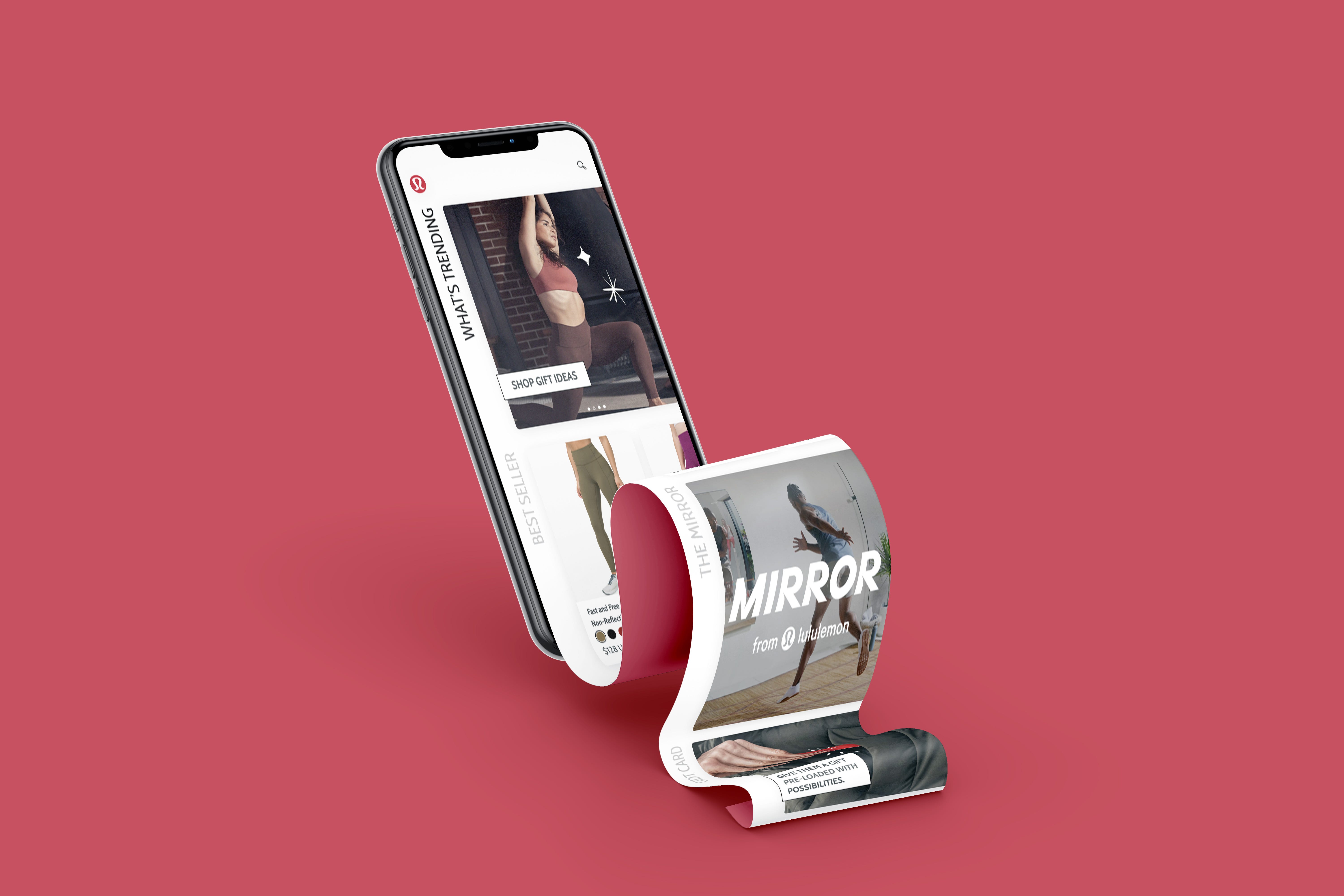
After I decided to focus on improving the user experience for Lululemon’s mobile app, my first step is to conduct the market research of Lululemon from two aspects: researching the brand and design of itself and researching its competitors.
Market research
Basically, market research is to study everything about the brand. What is Lululemon? What is lululemon’s marketing strategy? Why do people choose Lululemon? Marketing research is important for design because a great design solution must have a great balance between business and aesthetics, and market research helps designers understand the business model of the brand. Based on my market research and reviewing different marketing reports, I summarized the information into a few keywords: lifestyle, female, luxury, community.
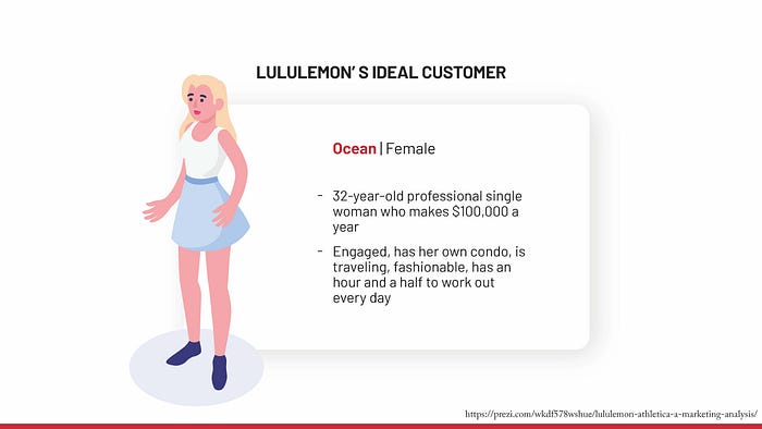
Additionally, I found Lululemon’s target customers are:
In the end, when I compared Lululemon’s website design to mobile design, I found that there is a lack of consistency between website design and mobile design, which led to great design opportunities.
Competitor Analysis
I also looked up Lululemon’s competitors’ mobile app design. From market research earlier, I learned that Lululemon currently tries to march towards the mass market, so it’s necessary to see how other brands showcase their brand on their mobiles. Among all the brands, Adidas and Zara’s mobile experience attracted me the most, because their displays are modern and clear. They are two good examples that Lululemon could learn from.

02 Research & Insights
Interview
While I am conducting market research, I also scheduled an interview with a Lululemon’s target customer. I interviewed Emma, who is a typical Lululemon’s target customer and great candidate for user research, because 1) she likes to workout at home; 2) she works in a high-tech firm in silicon valley, 3) she had never used Lululemon’s mobile app before.
The entire interview process included two parts: observation and deep-dive interview.
During the observation part, I asked Emma to complete two tasks and think out loud: 1) exploring a few featured items; 2) buying a holiday gift for herself. During this process, I didn’t speak or ask any but only took notes on how she reacted to the app.
After she finished the tasks, I conducted a deep dive interview as the second part. Specifically, based on my observations, I walked through her experience and understood her pain points. I tried to let her talk most of the time and kept asking “why?” to guide her to speak more about her deep thoughts.
Insights

Based on the interviews, I learned many insights from the interview:
- Confusing homepage layout
- Information prioritization is messy
- Hamburger button causes confusion for users
- User doesn’t feel attracted to use the featured items
- User didn’t understand if there is a new launch from the homepage
- The value proposition and the brand goals are not aligned to the user - Hard-to-understand filters
- User has difficulty to locate filter and sort
- User has difficulty to switch the view mode - Too big images, too little information
- Both grid and list view have huge images but little information
- On the product detail page, the user needs one more page to see too little information
03 Design
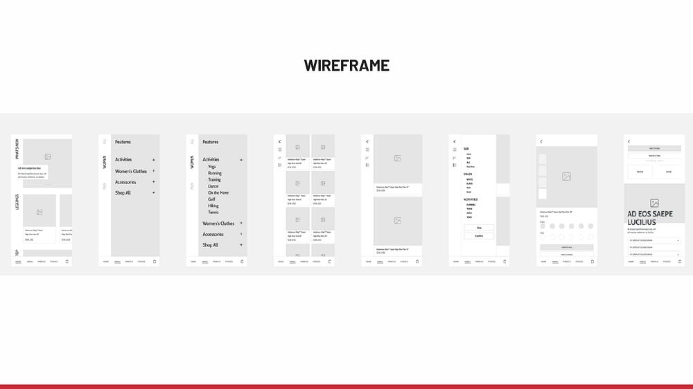
Based on both insights from marketing research and the user interview, I decided to focus on the homepage and shop page. My concept is to change the app’s layout to a side menu with a navigation bar on the bottom.
There are many benefits of using a side menu: 1. It highlights the categories of information and improves the Information prioritization; 2. It gives users a modern feeling; 3.Side menu is trending among competitors’ apps. In addition to using a side menu, I also added the navigation bar on the bottom of the screen that can help users locate themselves and easily switch between different pages.
By using the side menu and navigation bar, this concept fully uses vertical and horizontal gestures, it attracts users to stay on the app longer and to browse more products.

04 Testing
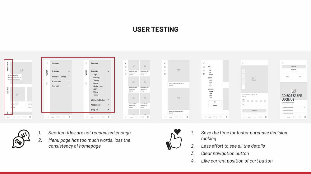
After my first prototype, I did another user testing with Emma for quick feedback. I asked her to explore the prototype and tell me what her thinking process was. I got some really valuable feedback.
05 Final Design
Based on the second testing, I refined the wireframe with more clear user flow. The biggest change is in the menu page, as I updated it to a more image-based experience. This way, the featured items could appear more obvious and attractive for better business outcomes.


Final Learning
In the end, I asked myself: “If I had more resources, what would I improve/change my design?”
First, talk to Lululemon’s market team to get more information about its homepage strategy priority. For now, I can only use my knowledge and understanding to select the information, but I can imagine that the business strategy might change the information priority totally.
Second, talk to Lululemon’s developer team to learn the engineering capacity. I believe designers always collaborate with everyone on the team to work the best design solution out.
Last but not least, keep consistency in all the visual elements if I had access to their design system.
Finally, I passed this design challenge interview and received the offer from this company(though I didn’t accept it). I learned so much from this design challenge, and my biggest takeaway is: it’s important to show your thinking process and how you make design decisions. For employers, they want to know if this designer could best work in their team and collaborate with all other teammates. Therefore, as designers, we need to not only showcase our skill set but also show strong communication skills from our presentation.

